
How to Design a Stunning Instagram Grid for Lasting Impressions
In today’s fast-paced digital world, social media platforms have become more than just communication tools—they are visual storytelling spaces. Among them, Instagram stands out for its emphasis on images, design, and aesthetics. While single posts may grab attention, it’s the overall appearance of your profile grid that leaves a lasting impression. The arrangement, balance, and flow of images can turn an ordinary feed into a visually compelling digital portfolio.
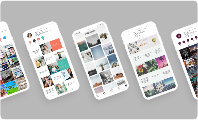
For those who want to elevate their online presence, using an Instagram grid maker can help bring structure and creativity to your profile. Instead of treating each upload as an isolated post, this approach ensures your grid looks cohesive and professional, allowing you to express your style or brand identity in a powerful way.
Why the Instagram Grid Matters
Your Instagram profile is often the first impression new visitors get. Whether you’re an influencer, entrepreneur, artist, or simply someone passionate about sharing visuals, the grid acts like a visual résumé. A thoughtfully arranged feed conveys professionalism, creativity, and attention to detail, while a random layout may appear cluttered or unorganized.
Brands and content creators often rely on grid aesthetics to communicate themes, highlight campaigns, or maintain a consistent tone. This visual harmony not only attracts followers but also keeps them engaged, making it more likely they’ll return for future content.
Types of Instagram Grid Styles
There is no one-size-fits-all design, and that’s the beauty of Instagram grids. Depending on your goals and personality, you can choose from several popular styles:
- Checkerboard Layout – Alternating colors or content types in a chessboard-like pattern. This works well for balancing quotes with photos.
- Vertical Lines – Consistent content in one column, such as text in the middle and images on either side. This creates a neat, structured look.
- Diagonal Flow – Images that follow a diagonal sequence across the feed, giving a sense of movement and rhythm.
- Row by Row Theme – Each row represents a topic or visual story, making your profile look like a series of mini-galleries.
- Puzzle Grid – One image divided into multiple posts, forming a larger visual when viewed on the grid. This is bold and eye-catching, often used for campaigns or product launches.
- Minimalist Grid – Clean, simple visuals with plenty of negative space to highlight one key element per post.
Experimenting with different styles helps you discover what resonates best with your audience.
Benefits of Using a Grid Strategy
An intentional grid design offers several advantages:
- Consistency: It helps maintain a uniform color palette, filter style, or theme.
- Storytelling: Each post contributes to a bigger narrative, drawing viewers to scroll and explore.
- Professional Appeal: A polished feed increases credibility, especially for businesses or personal brands.
- Memorability: A distinctive grid style makes your profile stand out from countless others.
- Planning Efficiency: Working with a structured design reduces the stress of last-minute posting.
Planning Your Instagram Grid
Designing a grid is both an art and a strategy. Here’s how you can approach it:
- Define Your Theme: Decide what your profile represents. Is it lifestyle, travel, business, or personal expression?
- Choose a Color Palette: Consistent tones—whether warm, cool, or monochrome—create harmony.
- Select a Layout Style: Pick from the styles mentioned earlier based on your goals.
- Plan Ahead: Use design tools to preview your grid before uploading. This ensures every new post blends with the existing layout.
- Maintain Balance: Alternate between different content types (e.g., close-up shots, wide views, text-based posts) to avoid monotony.
Mistakes to Avoid in Grid Design
Even with the best intentions, it’s easy to fall into common pitfalls:
- Ignoring Alignment: Randomly posting images without considering their effect on the grid leads to visual chaos.
- Overloading with Colors: Too many clashing shades can overwhelm the viewer.
- Excessive Text Use: While quotes or captions can add value, too much text disrupts visual flow.
- Neglecting Image Quality: Blurry or poorly edited photos reduce the overall appeal of the grid.
- Inconsistent Posting: A great grid loses impact if updates are irregular or rushed.
By avoiding these mistakes, your grid can remain engaging and cohesive.
Balancing Creativity with Authenticity
While aesthetics matter, authenticity should remain at the core of your grid design. Followers connect with content that feels real and relatable, not overly staged or artificial. Balance professional visuals with genuine storytelling, allowing your personality to shine through.
For example, an artist might combine polished artwork with behind-the-scenes shots. A business could mix product photos with customer testimonials. A traveler may post scenic landscapes alongside candid cultural moments. This balance keeps your grid beautiful yet human.
The Role of Grid Design in Branding
For businesses, the Instagram grid goes beyond aesthetics—it becomes a brand communication tool. Color schemes, typography, and consistent layouts mirror brand identity across all digital touchpoints. A well-organized feed increases brand recognition and builds trust among potential customers.
Even for personal profiles, grid design can establish a unique online identity. Whether you want to appear adventurous, minimalistic, or sophisticated, your grid style communicates these qualities silently yet effectively.
Keeping Up with Trends
Social media design trends evolve rapidly. From pastel-toned feeds to bold neon highlights, what’s popular today may shift tomorrow. While it’s useful to stay aware of trends, the most important factor is consistency. Followers appreciate reliability, and your unique visual voice matters more than chasing every new fad.
Final Thoughts
An Instagram profile is more than a collection of pictures—it’s a curated digital canvas. A thoughtfully designed grid transforms scattered posts into a cohesive visual story that captures attention and builds loyalty. Whether you’re an individual expressing creativity or a brand strengthening identity, investing effort into your grid design pays long-term dividends.
By choosing the right layout, avoiding common mistakes, and balancing aesthetics with authenticity, you can create a feed that stands out in the crowded digital space. In the end, your Instagram grid is not just about visuals—it’s about the story you choose to tell.